Italiano
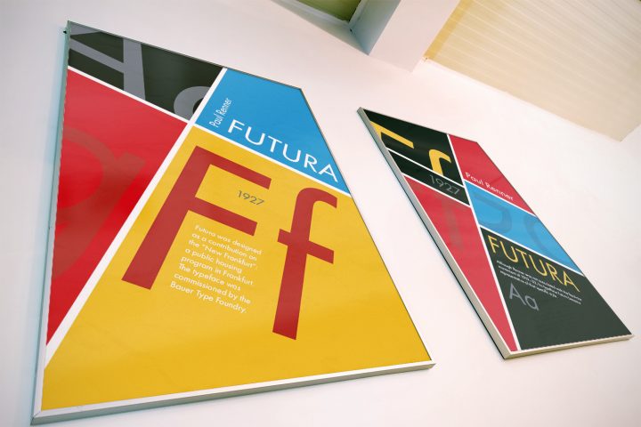
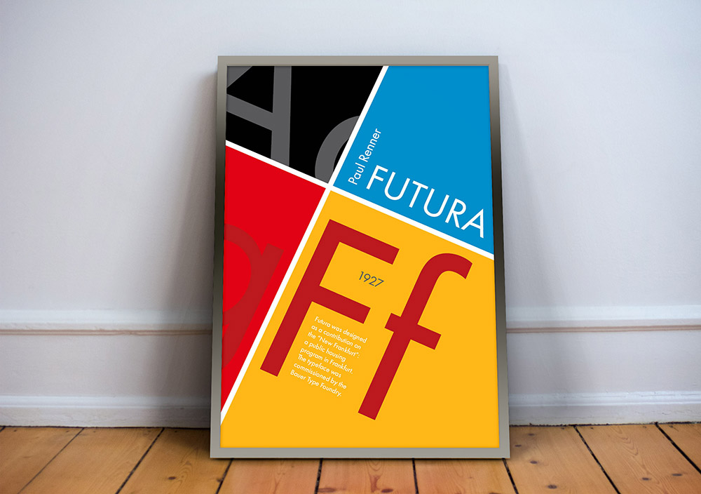
Project Type: Gridded poster compositions
Year: 2017
The objective of this project was to create a set of gridded poster compositions that emphasized the physical form of a pre-selected type and the historical context in which the typeface was created.
Requirements:
- use the typeface only (not any of its permutations: bold, italic, compressed, and so forth);
- not include illustrations or photography;
- feature the name of the typeface, a brief description, the name of the type designer or designers, the date(s) of the type design.
I focused on the lines and structure that were used to create the font and got inspired by Bauhaus simple forms and colors.
About Futura
Creator: Paul Renner
Foundry: Bauer Type
Metal type: Released in 1927
Digital type: 1987 Futura Eugenia, Futura Futuris 1991, 1995 Futura PT, 1999 Futura ND
Futura is a geometric sans-serif typeface. It was released in 1927 -but designed in 1924- by Paul Renner, a German typeface designer.
Paul Renner
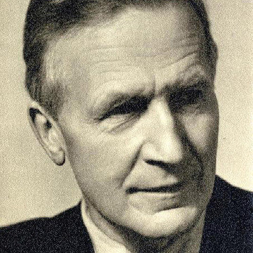
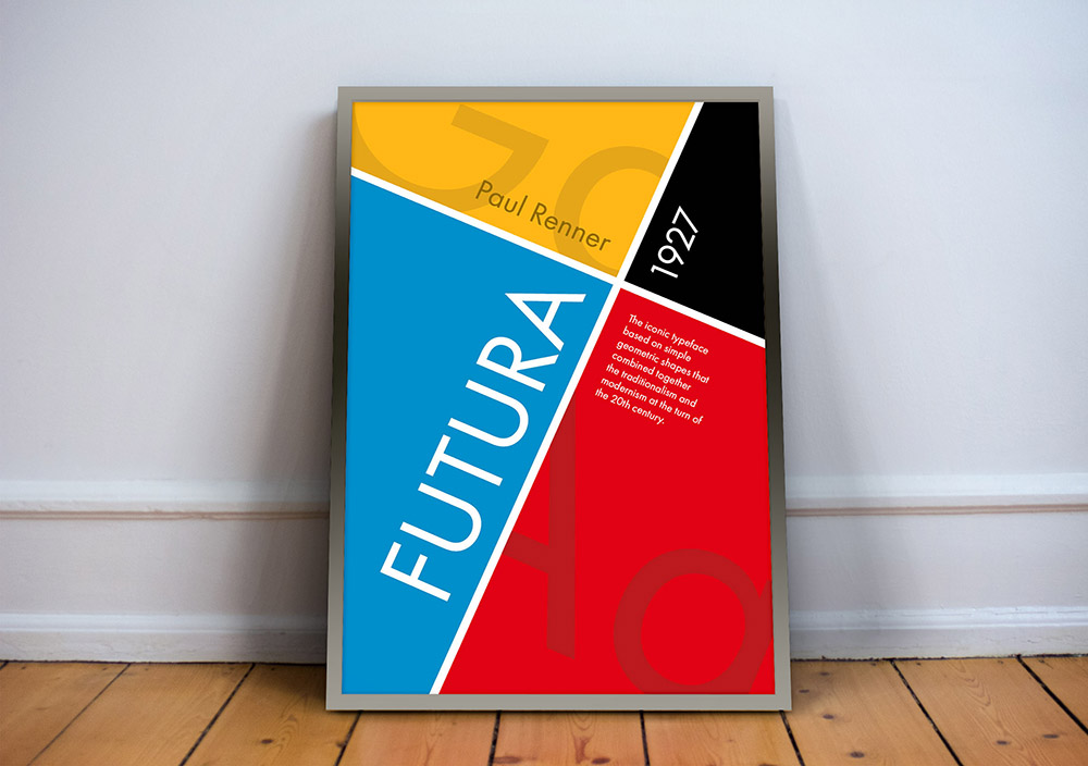
Renner was a man of strong and unmovable beliefs: not only he was Protestant, but also an active anti-Nazis. Other than in religion and politics, his firmness shows also in his sense of duty and in his professional choices. He was a member of the German Work Federation and his rejection of abstract art and modern culture were well known. Despite this, Renner is seen as a bridge between the traditionalism of the 19th century and the modernism of the 20th century.
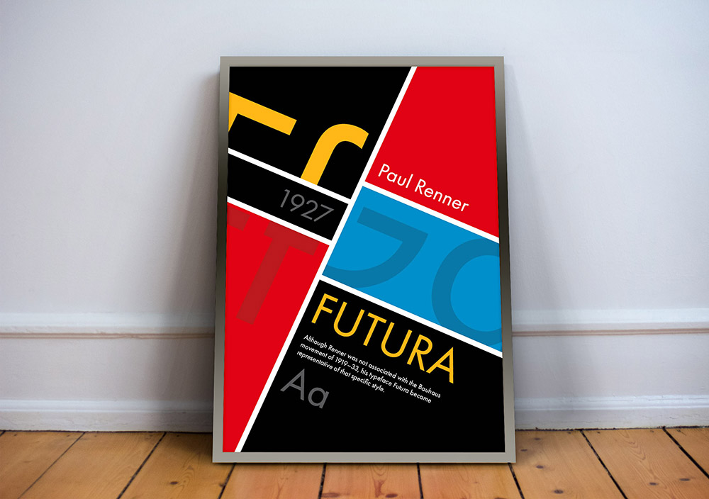
His typeface Futura is based on simple geometric shapes (circles, triangles, and squares). Because of that, it became representative of Bauhaus’s style in 1919–33.
Although Renner was not associated with that art movement, he shared many of its idioms. For instance, he believed that a modern typeface should express new models, rather than revive previous design.
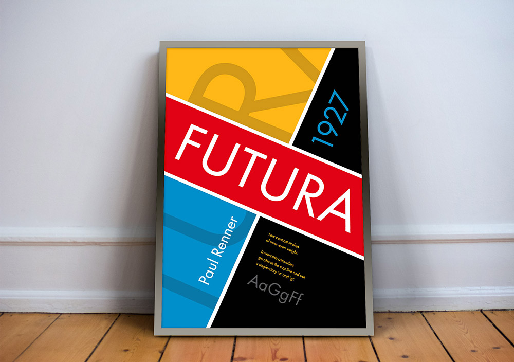
Futura anatomy
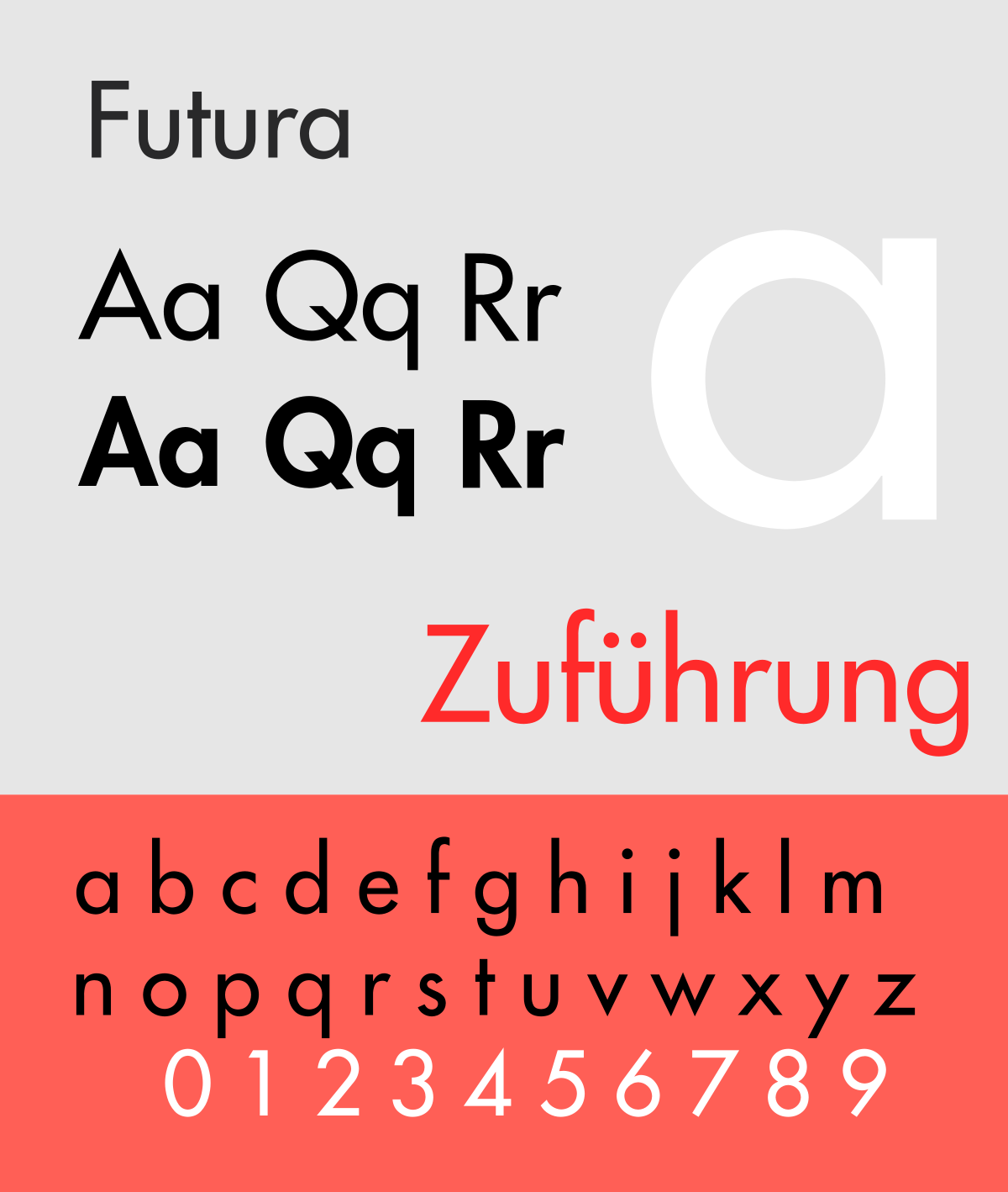 Based on that believes, Paul Renner designed Futura with low in contrast strokes of near-even weight. The lowercase ascenders go above the cap line and use a single-story ‘a’ and ‘g’. The uppercase characters, on the other hand, have similar proportions to the classical Roman capitals.
Futura was designed as a contribution on the “New Frankfurt”: a public housing program in Frankfurt. The typeface was commissioned by the Bauer Type Foundry.
The typeface is still in fashion and it’s used by brands such as Dolce and Gabbana, Omega, Gilette, and Cisco.